
Double Watch Winder Product Listing Guide for Retail and Private Label Programs
Why a Double Watch Winder Needs Its Own Product Story
A double watch winder is not simply a single-winder format with one more position. For a retailer, distributor, or private-label brand, the two-watch layout changes how the item is displayed, photographed, explained, and compared with the rest of an accessory range. A good product listing should make that difference immediately clear.
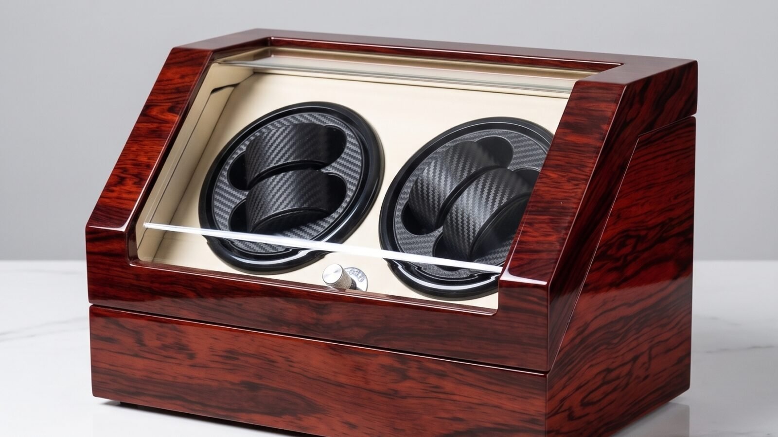
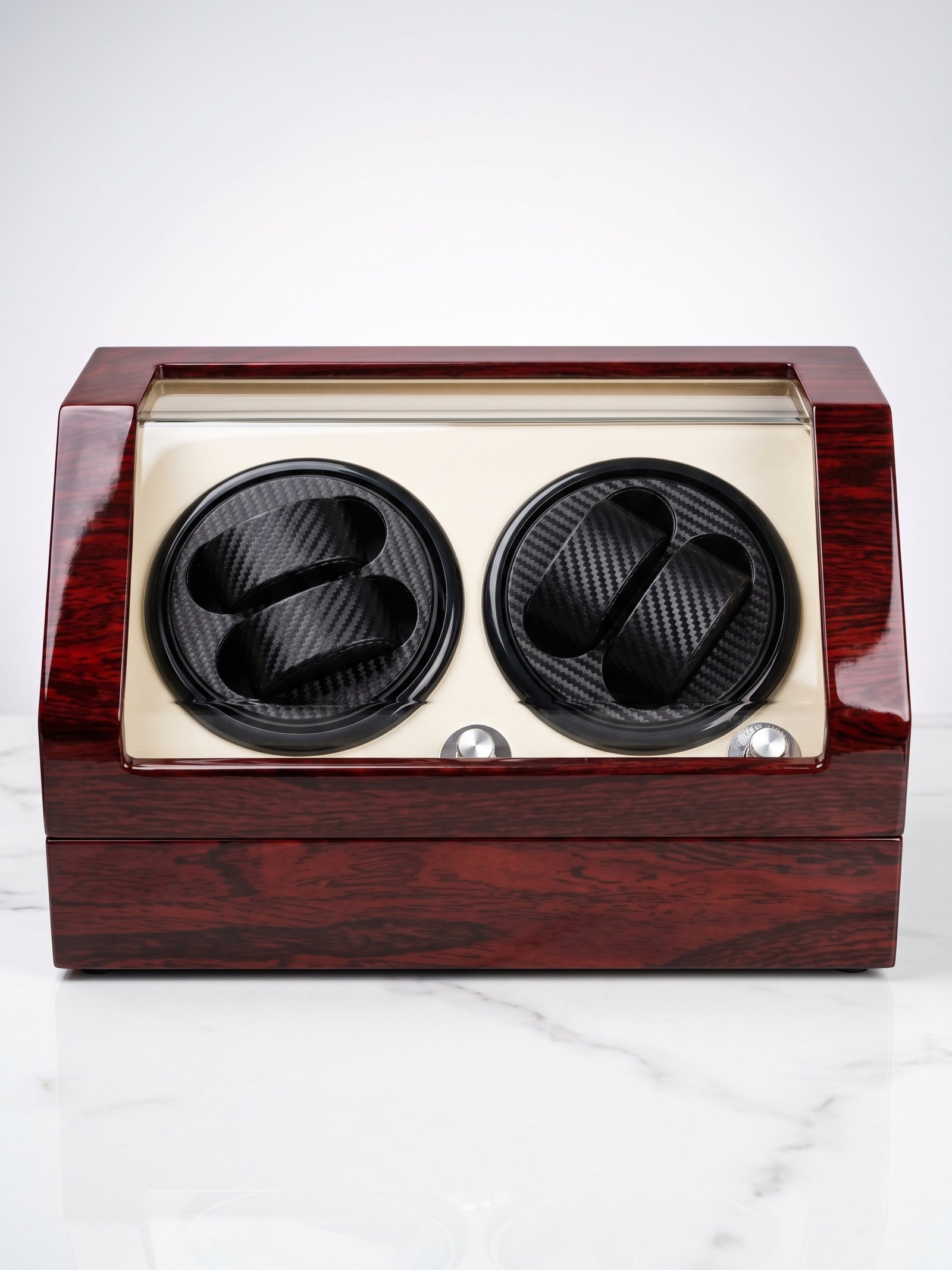
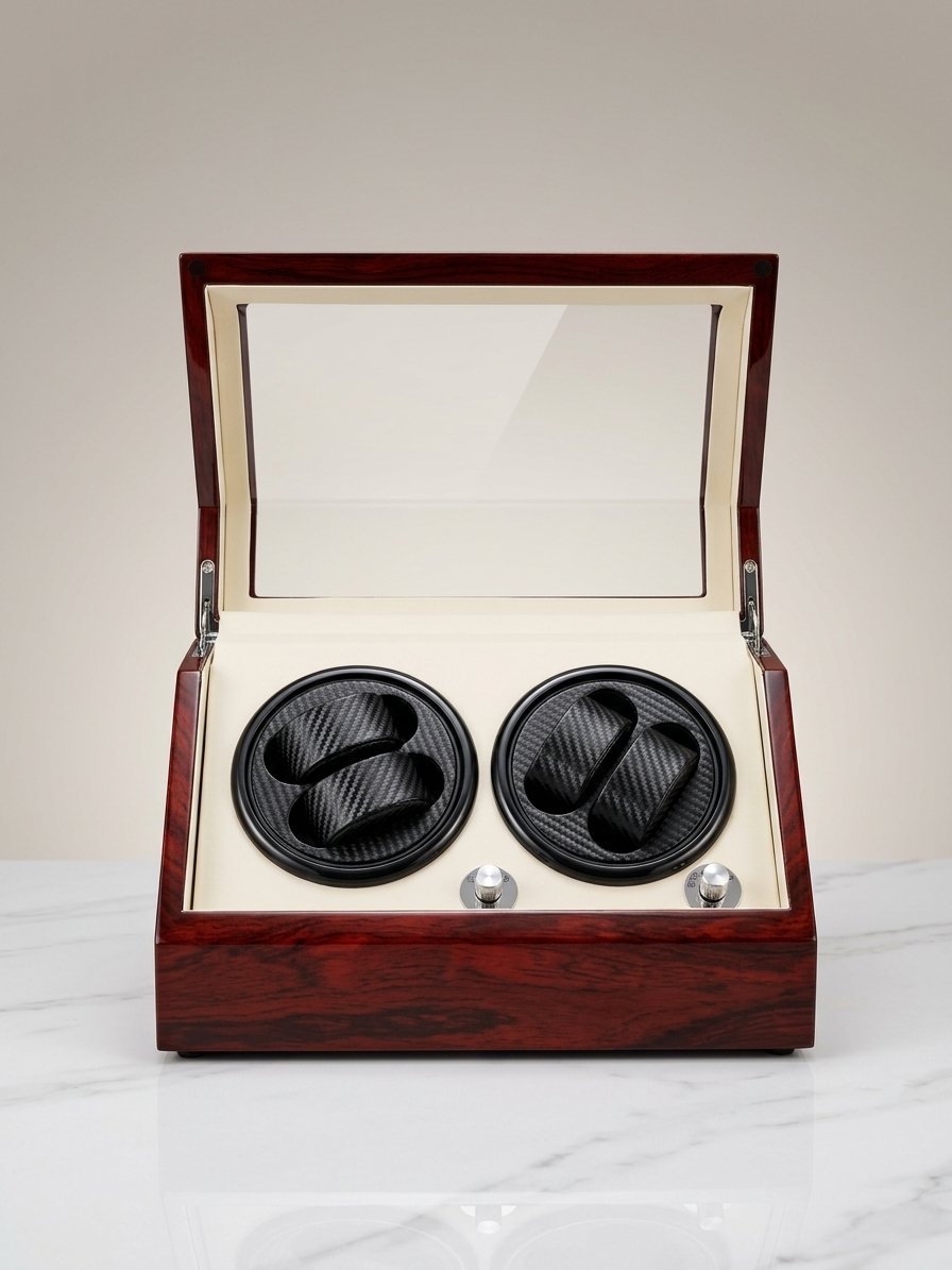
The supplied WW-8002 images provide a useful example. They show a closed two-watch cabinet with a red wood exterior, an L-shaped acrylic front, two visible black carbon-fiber-pattern cushions, and an open view with a cream interior and two control knobs. Those visible details give a buyer more to assess than a catalogue name alone. They establish the product’s format before a sales conversation turns to specifications that still need confirmation.
For B2B programs, the goal is not to decorate a listing with more images. It is to help a prospective retailer understand where the double watch winder fits: as a paired-watch accessory, a gift-ready item, or one component in a coordinated storage assortment.
Start the Listing With Format, Use Case, and Visual Hierarchy
The first screen should identify the product as a double watch winder and show the closed cabinet clearly. A straight-on or slight-angle product image works well because it lets the buyer understand the two-position layout, exterior color direction, front window, and overall tabletop presence without opening the gallery.
That first visual should be paired with plain product language. State the intended role before listing technical options: a two-watch winder for a private-label accessory line, a retail display assortment, or a customer gift program. This is more useful than a string of unverified feature claims.
For a catalogue or wholesale page, buyers should be able to answer three questions quickly: What is the format? What can be seen when it is closed? Where might it sit within a collection? The watch winders category can then give them a route to related designs and capacities.
Let the Closed Exterior Do the First Selling Work
The closed product view is often the image that a retailer will reuse in a line sheet, assortment review, or initial marketing discussion. It should not be treated as a decorative header. It has to establish the recognizable exterior details that remain visible in a shelf display or e-commerce thumbnail.
With the WW-8002 images, the red wood cabinet and L-shaped acrylic-front presentation make the double-watch format legible without showing a watch on each cushion. This is valuable when a buyer is deciding whether the product has enough visual presence to sit beside watch boxes, jewellery storage, or other desktop accessories.
Avoid overloading this section with measurements, movement claims, or material labels unless they have been confirmed for the exact SKU. A clear visual description, an accurate product name, and confirmed brand positioning create a stronger starting point than assumptions copied from another model.
Use the Open View to Explain the Customer Experience
The interior image is where the listing can move from appearance to use. An open double watch winder should show the buyer how the two positions are arranged, what the cushions look like, how the interior contrasts with the cabinet, and where the controls are located. These are all practical questions for a retailer deciding how much explanation the end customer may need.
In the supplied open image, the cream interior and paired black cushions give the product a different visual reading from the closed exterior. That contrast is worth showing. It helps a buyer judge whether the product suits an existing brand palette, gift presentation, or private-label collection.
The product page should describe only what can be verified. If rotation direction, turns-per-day options, timed rest, power method, or compatible watch sizes are not confirmed, present them as points for the sourcing conversation rather than claims in the public listing. Olymbros can discuss adjustable rotation direction, TPD, and timed rest through OEM/ODM customization, but the final configuration should be approved for the specific product.
Keep Technical Content Separate From Visual Claims
Many watch winder listings become confusing because visible details and technical details are blended together. An acrylic-front cabinet, two cushions, and control knobs can be described from the photographs. Performance statements need a different standard: they should come from the confirmed product specification and the destination-market plan.
For a B2B listing, create a short “to be confirmed” review area before the product goes live. It can cover SKU, finished material, dimensions, watch-fit guidance, rotation programs, power arrangement, included accessories, packaging, compliance documentation, and minimum order requirements. This protects the retailer from carrying forward a provisional specification into public copy.
The same discipline makes private-label work easier. Olymbros offers OEM, ODM, and private-label development, and its integrated production includes woodworking, lacquering, motor assembly, and interior work. A clear division between approved visual content and pending specifications helps both sides review a double watch winder without losing track of what has actually been signed off.
Build a Four-Image Sequence That Answers Buyer Questions
For this type of product, four well-chosen images are usually more useful than a long gallery of near-duplicates. The supplied set supports a practical sequence:
- a featured image showing the closed winder at an angle;
- a front-facing closed view that makes the two-watch format clear;
- an open interior view showing the cushions and visible controls; and
- an open three-quarter view showing the relationship between cabinet, interior, and controls.
Each image should earn its place by answering a different question. The first confirms shelf presence. The second shows capacity in a simple way. The third reveals the contact surfaces and interior presentation. The fourth gives a fuller sense of the product experience. Accurate alt text should be written after the final images are inspected, not generated from a filename or a wish list.
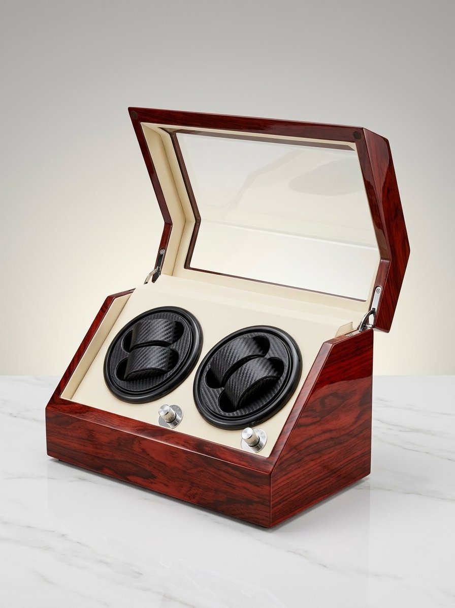
This approach also creates reusable assets. The same image order can support a wholesale PDF, a LinkedIn product update, a Facebook post, or a buyer presentation while keeping the public story consistent.
Position the Double Winder Within an Accessory Range
A double watch winder becomes easier to merchandise when it is not treated as an isolated item. A brand may position it next to watch boxes for static storage, travel cases for mobility, or watch stands for display. The products do not need to use identical finishes, but they should share a clear relationship in materials, interiors, logo treatment, or packaging direction.
For private-label buyers, this creates a useful path for range planning. Start with the double winder as the automatic-watch care item, then identify which adjacent accessories belong in the same price tier and visual family. Product photography should reflect that decision over time, rather than making every SKU look unrelated.
The listing can invite a commercial discussion without making unsupported promises: which exterior direction, interior contrast, branding placement, and packaging approach would make this two-watch format feel like part of your range?
Use a Pre-Publication Review Before Making Claims Final
Before the product is published, the buyer and manufacturer should review the exact image set, product title, visible description, and specification table together. This is the point to confirm whether the red wood appearance is the final material and finish description, whether the control configuration matches the approved sample, and whether packaging or logo details are ready to be shown.
Olymbros states a 7-14 day sample period for OEM, ODM, and private-label projects. A sample review can therefore connect the visual listing to a concrete approval process: inspect the closed exterior, open interior, cushion presentation, control area, branding position, and packaging direction before public copy is finalized.
For retailers and brands building a two-watch offering, a well-organized product listing becomes more than an SEO page. It is a shared sales and review document. To discuss how this double watch winder could fit your range, contact us with your target channel, brand references, and the specifications you need confirmed.